Lead generation websites for service brands
Service founders, consultants, and local brands don't need a large site to look credible. They need three pages that each do one job well: introduce the brand, explain the offer, and make it easy to reach out. Read more on our blog.
The real problem with big sites
A large website looks impressive in a pitch deck. In practice, it spreads your message across too many pages, and visitors leave before they find the one thing they came for.
It splits your story across ten pages that all say a version of the same thing, so visitors have to hunt for the one answer they need. Most give up halfway through, and the inquiry never happens. Extra pages also mean extra upkeep, extra decisions, and more places for the message to drift off course.
It gives every page one job. Home earns trust and interest. Services proves fit. Contact turns interest into action. Nothing competes for attention, so the visitor always knows what to do next. Fewer pages also means the site stays simple for you to keep current.
Why visitors decide to trust you
Visitors don't trust a business because its site has a lot of pages. They trust it because the message is clear the moment they land.
A focused structure removes the guesswork. The visitor sees who you serve, what you offer, and how to reach you, without digging through a maze of navigation links.
That clarity is what turns a passive visitor into someone who feels confident enough to reach out.
The structure itself
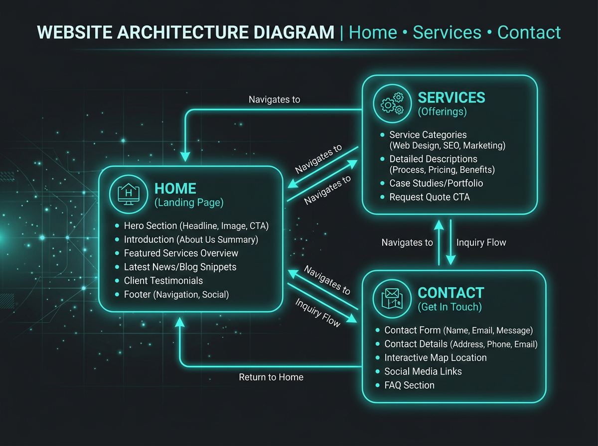
Instead of spreading your message thin, each page carries one part of the story and hands the visitor to the next.
Introduces your brand and makes the case for why a focused site is the stronger choice for generating inquiries.
Explains the offer in enough detail that a visitor can judge fit and decide whether to move forward.
Removes friction and hesitation so an interested visitor can submit an inquiry with confidence.
Built for three kinds of brands
If your business depends on people believing you understand their problem before they'll reach out, a focused site does more work than a large one. This offer was shaped around three groups in particular, each covered in more detail below.
Solo or small-team brands that need to look credible fast.
Advisors who sell expertise and need trust built quickly.
Small local businesses that want a clean way to be found and contacted.
Service founders
If you're running a solo or small-team service brand, your website's only job is to make people believe you're the right choice before they ever talk to you. A ten-page site doesn't do that faster than a three-page one — it usually does it slower, because the visitor has to work harder to find your answer.
A focused structure lets you say exactly who you help, what you offer, and how to start, without burying that message under extra navigation.
That's the version of "professional" that actually brings in inquiries: clear, direct, and easy to act on.
Consultants and advisors
When you sell expertise, visitors are deciding whether you understand their problem well enough to trust with the next conversation. That decision happens in the first few minutes, and it's driven by how clearly you explain your thinking, not by how many pages your site has.
A focused three-page site puts your point of view front and center on Home, backs it up with specifics on Services, and gives the visitor a direct, low-friction way to start the conversation on Contact.
There's no thin feeling when every page is doing real work.
Local service brands
Local brands don't need an elaborate site to earn a phone call or an email. They need something clean that clearly presents what's offered and makes contact obvious.
A focused structure shows your services plainly and puts the path to inquire in front of every visitor, without the polish-but-no-substance feeling that makes people hesitate.
Credibility and simplicity work together here, not against each other.
Before anyone will reach out
They should know what you do within seconds of landing, not after scrolling through several sections.
Specific, honest details about what's included matter more than vague promises.
One obvious path forward, not five competing buttons and links.
A simple inquiry, not a long form or a confusing process.
The core offer
LeadFlow Studio delivers a three-page lead generation website: a service-based brand's Home, Services, and Contact pages, built to create a clear and credible online presence that drives inquiries.
How the site gets built
A good-looking site that says the wrong thing still fails to generate leads. That's why the structure starts with your message: who you serve, what you offer, and why it matters to them.
Once that message is clear, the layout, headings, and design choices exist to support it, not distract from it. This is the difference between a site that looks nice and a site that actually converts.
Moving through the site
With only three pages and one main action, visitors never have to choose between competing links or wonder what to click next. The navigation itself becomes part of the persuasion.
Credibility, without the extras
A site doesn't need a stack of testimonials, credentials, or a long history to feel trustworthy. It needs to be specific about what it offers and honest about what it doesn't claim.
This site is built around what's actually true: a focused three-page structure designed to improve clarity, credibility, and inquiry flow. No inflated claims, no invented guarantees — just a clear offer, explained well.
After launch
Three pages means three places to review when your offer or message evolves, not fifteen.
A focused structure keeps your message consistent because there's less surface area for it to wander.
Anyone helping manage your site later can understand the whole structure in minutes.
The visitor's journey
The story here reframes what a strong website actually needs to be.
Here they evaluate what's included and decide it's worth pursuing.
The path ends where it should — with a real conversation started.
Before you decide
For most service founders, consultants, and local brands, yes. The goal isn't to cover every possible topic — it's to give visitors exactly what they need to trust you and reach out. Home, Services, and Contact cover that fully.
No. Professionalism comes from clarity and structure, not page count. A confusing ten-page site looks less credible than a clean, well-organized three-page one.
Start with the structure that solves your immediate need: clarity and inquiries. That's a conversation worth having directly, so bring it up when you reach out.
Go deeper
The Services page breaks down what each page of the site does, why the structure is built this way, and which brands it fits best.
See If It FitsThe next step
You don't need to have every detail figured out before reaching out. A short inquiry is enough to start a focused conversation about whether this approach fits your brand.
Get My Lead-Ready Site